

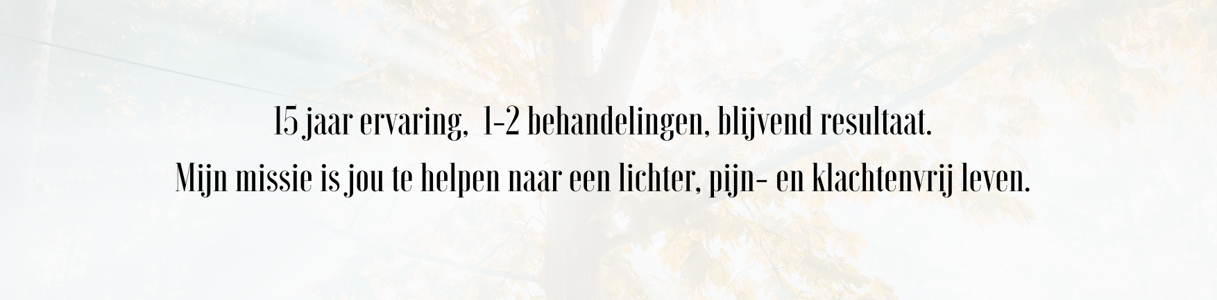
“Are you ready.. to get uplifted?”, “It’s time to Level Up!” and “15 years of experience, 1-2 treatments, lasting results. My mission is to help you reach an easier life, free from pain and complaints.”
These are the slogans introducing my sisters’ new business adventure Level Up.
How it started
One of the first webdesign opportunities we got, was a family affair: thinking along and co-creating the corporate identity for my sister Annelies van Breugel and her new business.
After working in a medical centre as a physical therapist for 15 years, in 2022 it was time for something new. She started Praktijk Level Up, offering physical therapy combined with transformational cupping treatment.
Because she started from scratch, Annelies was figuring out and in need of a completely new corporate identity.
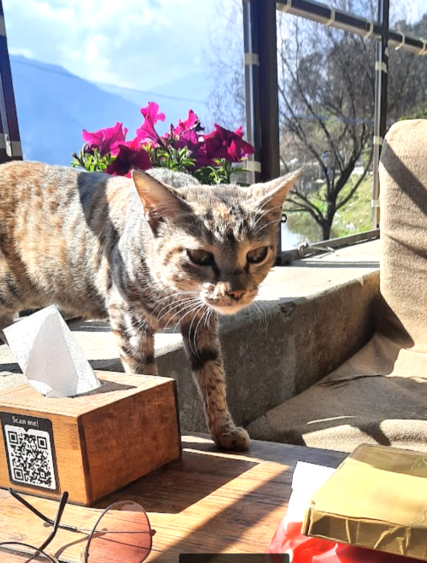
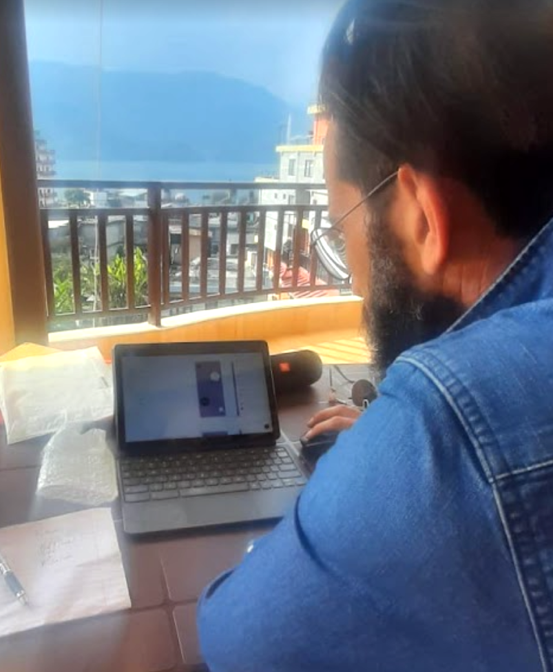
Setting up the design process from Pokhara in Nepal
Design process
Annelies asked us to think along about all the different aspects: the logo, the web & social media design and texts, her invoice and business cards, all done in an appealing & uniform style.
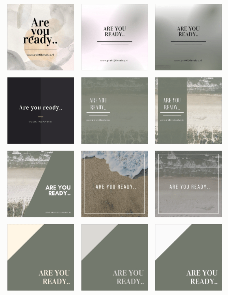
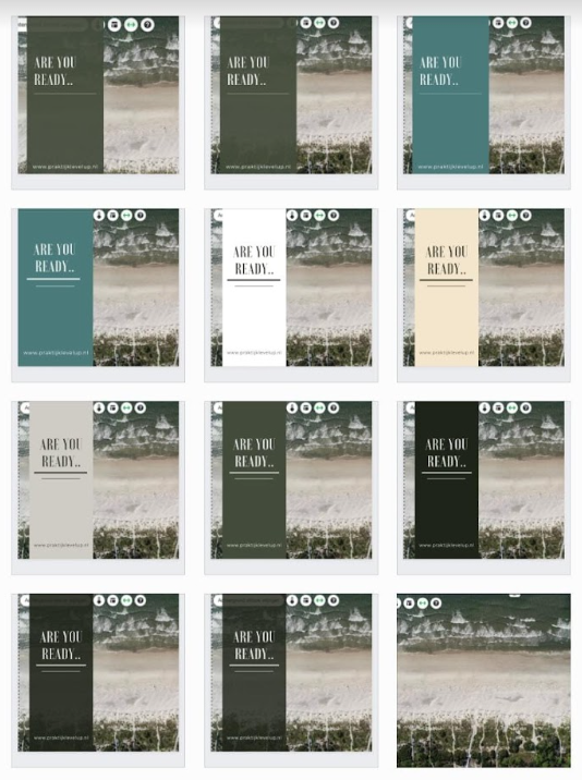
At first we came up with a beach theme. Very applicable, since the work location is in Noordwijk aan Zee, directly located at sea.
Moreover, Annelies was looking for a nature theme, and she loves the beach.
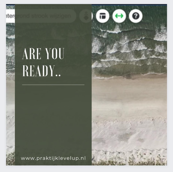
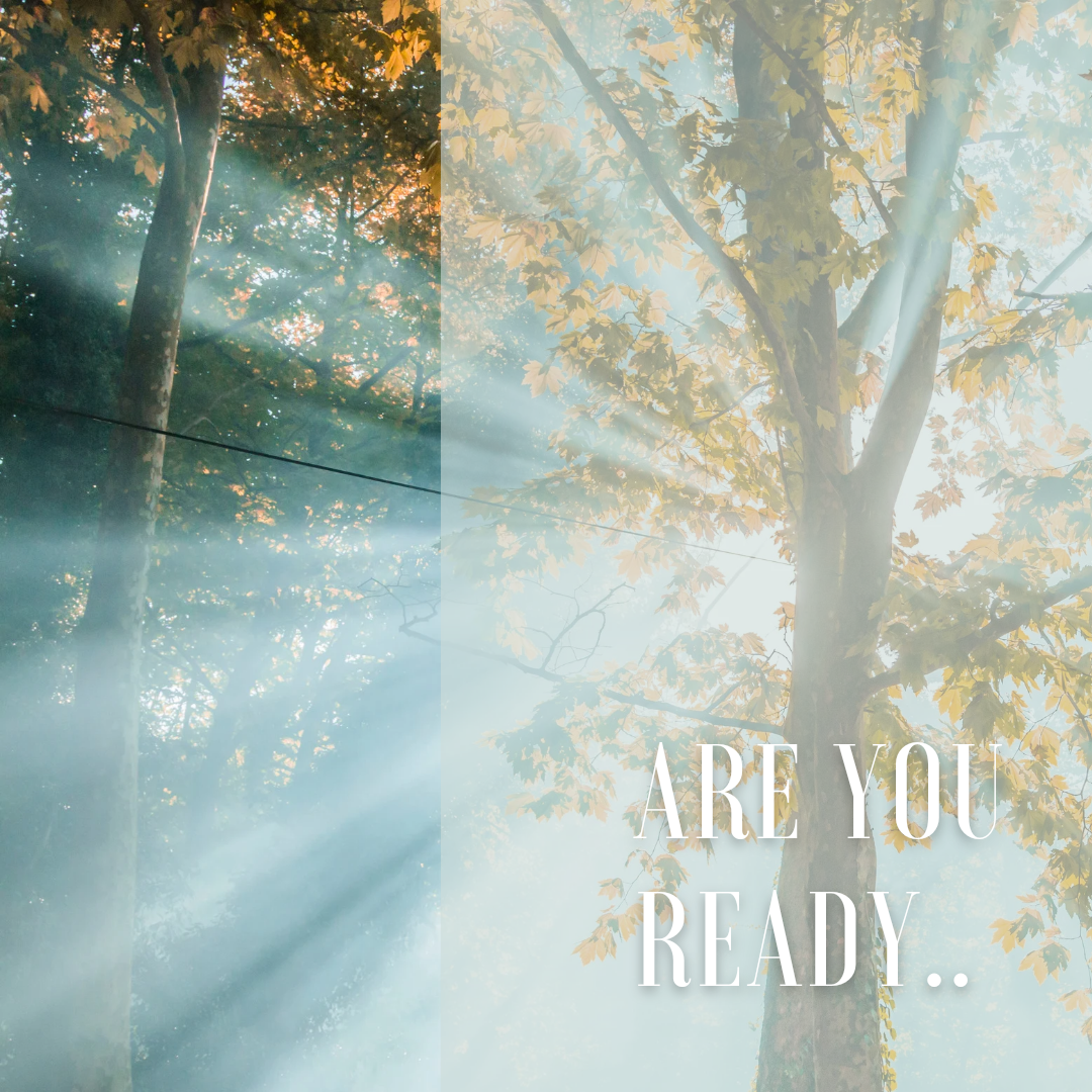
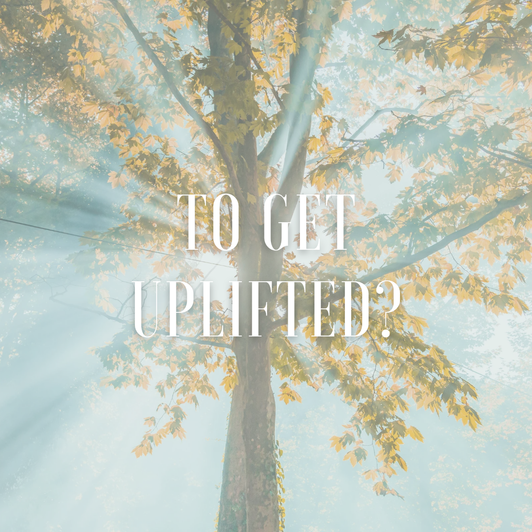
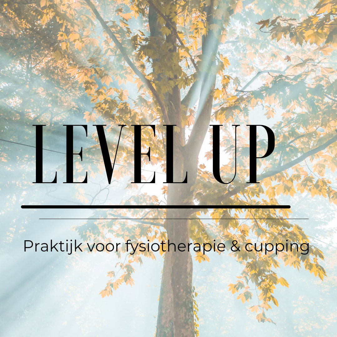
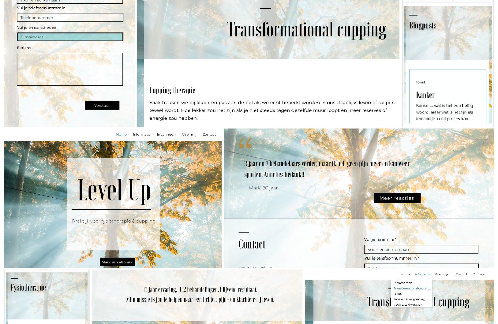
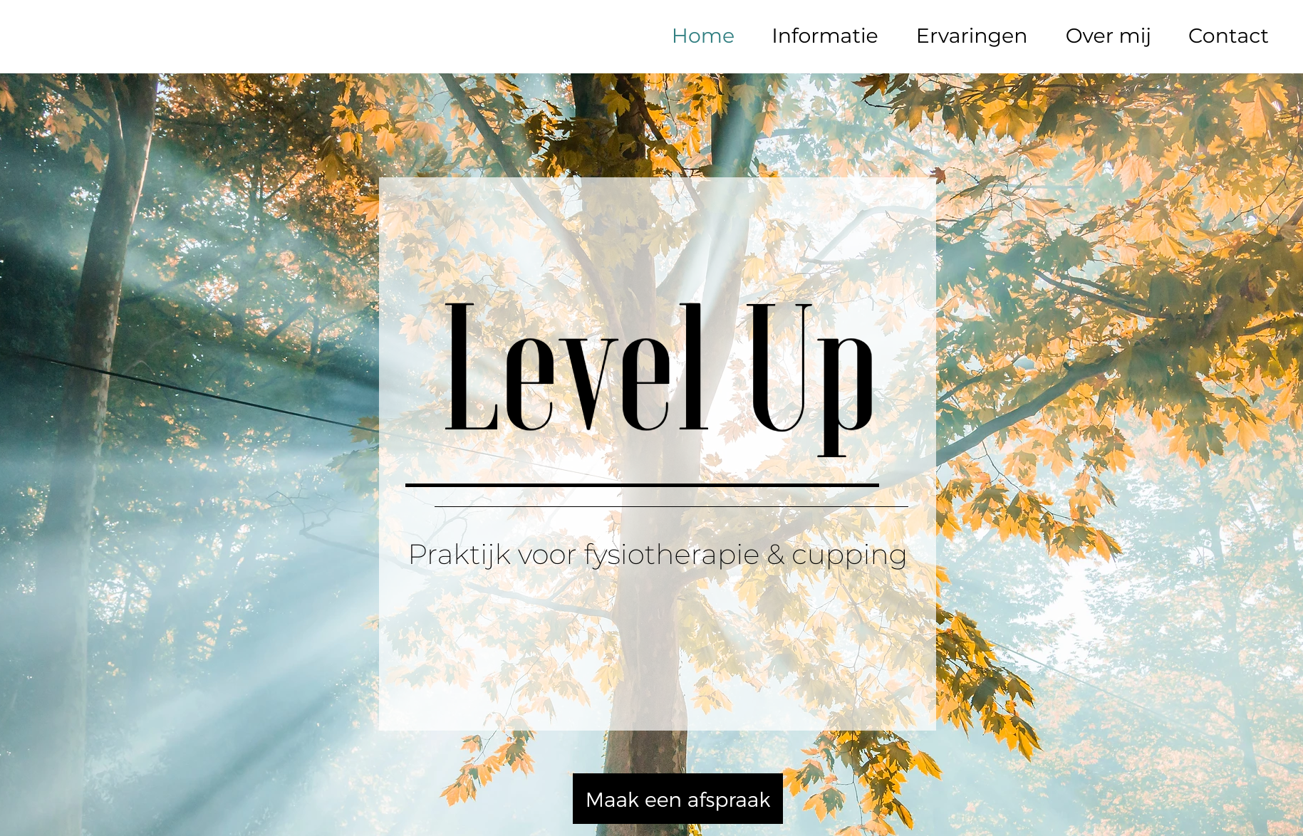
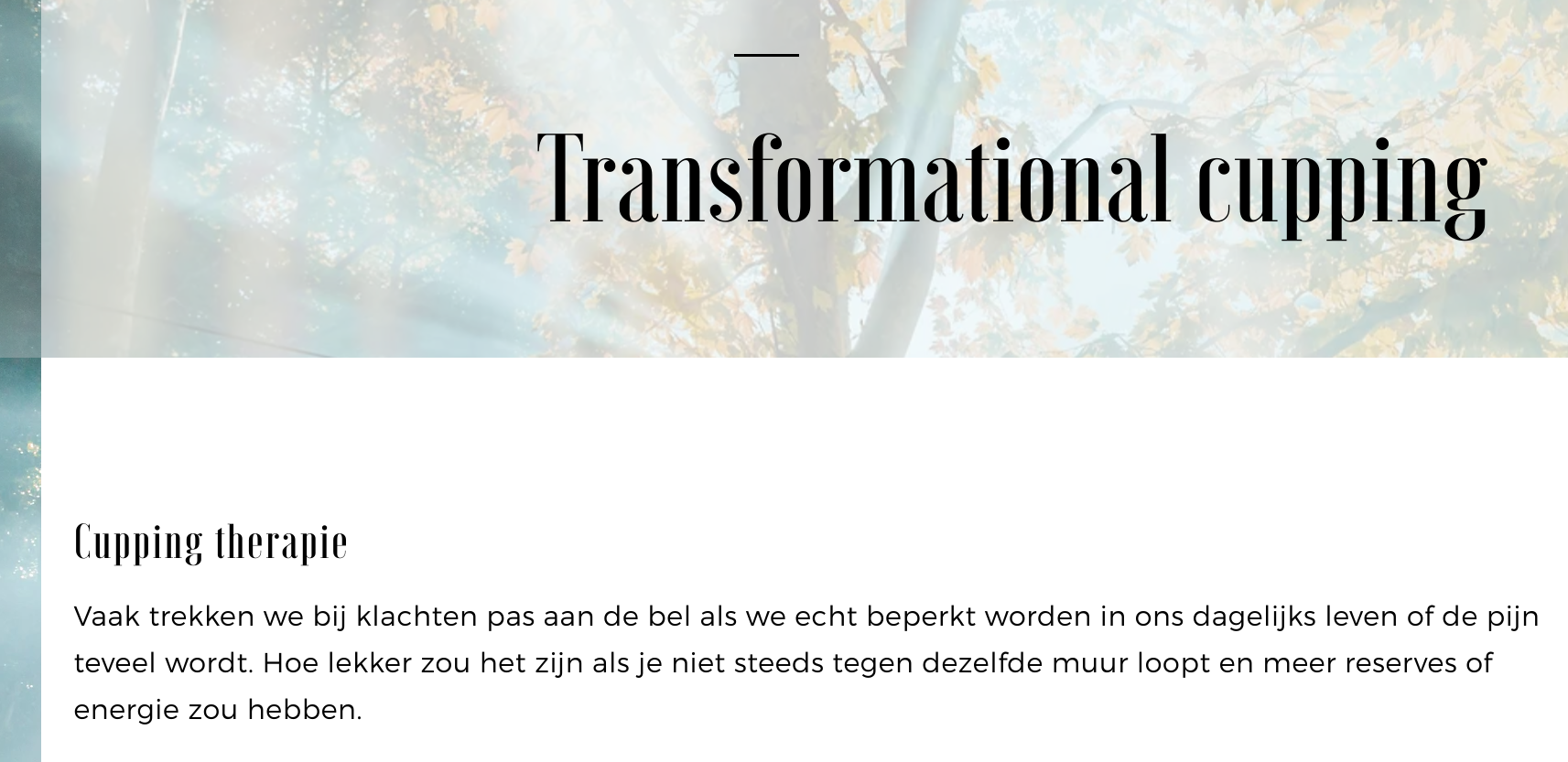
Shortly after, she found this colourful picture of a tree (see below). This ended up being the starting point of the process and centre of the design.

Other than the beautifully portraited image of the tree itself, the main reason Annelies chose this picture was because of the lighting.
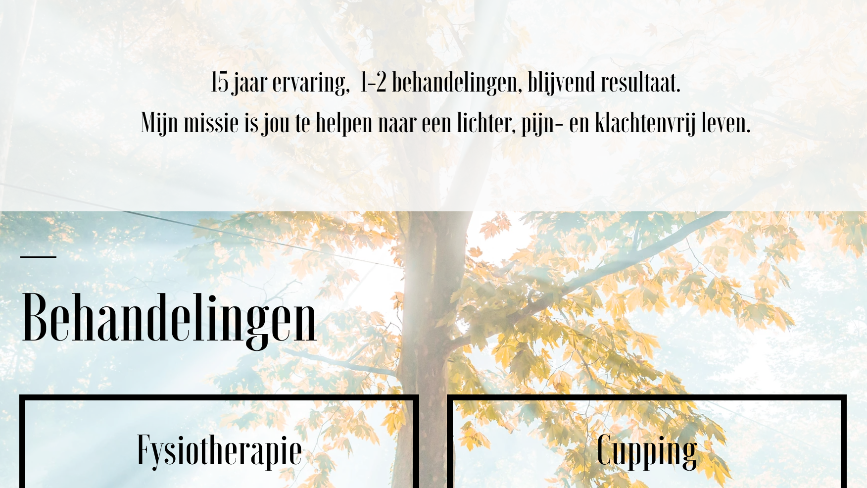
The filtered rays of sun light falling through the tree leaves: capturing the same feeling of light and relief she aims to pass on to her clients with her treatments.
Colors
Together we concluded that the colors of the image would make a nice palette for the website and Instagram design as well.
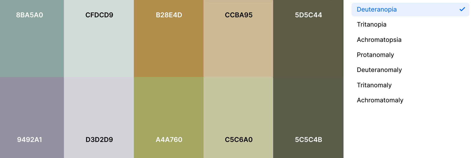
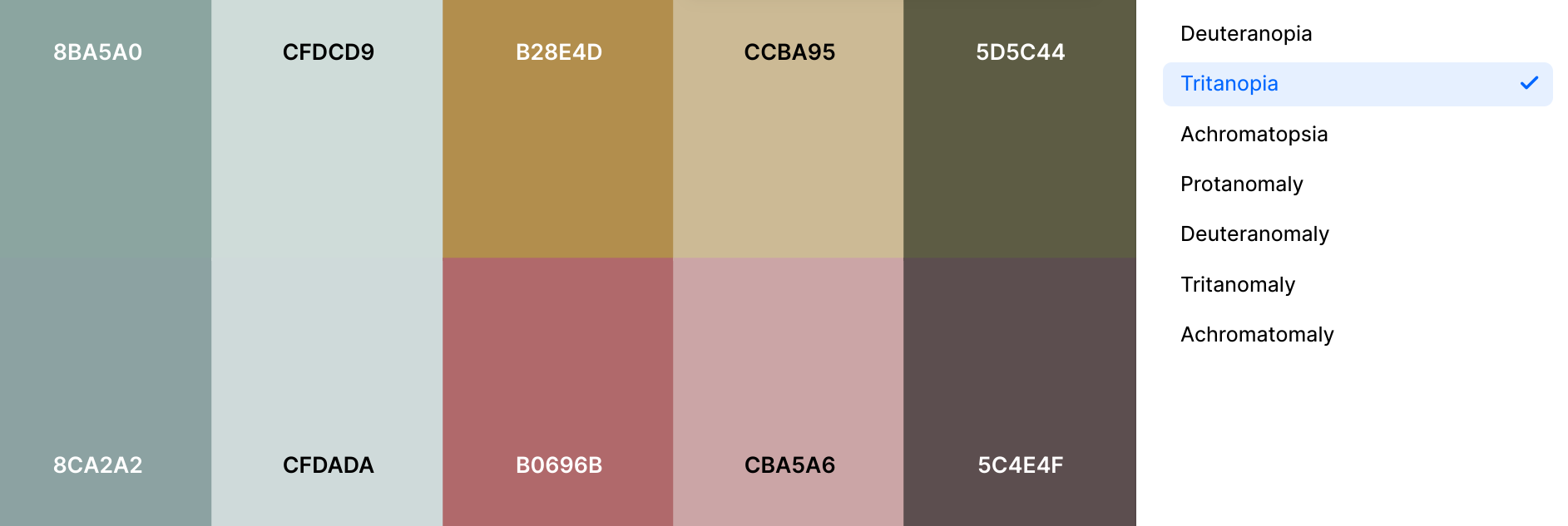
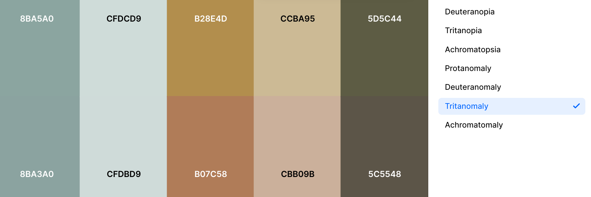
We chose a palette with enough color contrast, that’s also accessible for people with color blindness (see the color schemes below: above the chosen palette & below the way colorblind people experience this palette).
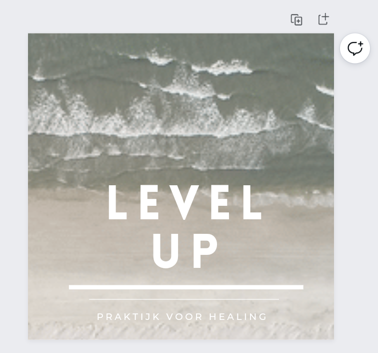
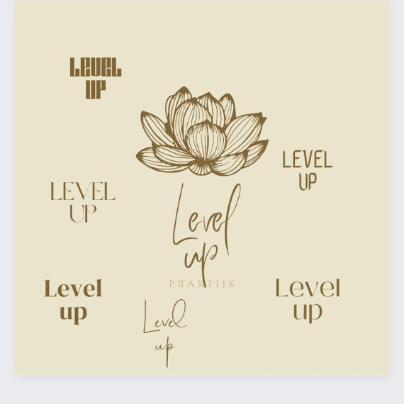
Logo
As soon as we started working on the project, we suddenly saw the name ‘Level Up’ appearing in all these different places!
Suddenly ‘Level Up’ is everywhere! 🙂
Our Level Up logo we wanted to give a clean and sleek appearance, preferably in basic colors or black and white. But, at the same time with the element of ‘leveling up’ visually incorporated in it.
The first attempts:
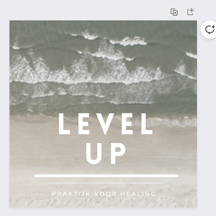
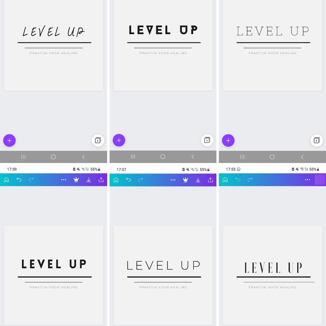
We tried to achieve the clean and elegant look by using the classy serif font Vogue for the business name, and the more subtle, geometric sans-serif typeface Montserrat for the subtitle.
“Vogue is serif, fancy, elegant, fashion font inspired by a popular magazine logo. Vogue is great for headlines, logos, covers, posters and other creative designs.”
(Source: Dafontfree.io)
The uplift element we created by adding 2 lines underneath the name, both different in size and placing. Suggesting a difference in level, or of a stair or steps (lifting you higher).
As you can see above, we made a couple of options, for the different media platforms.
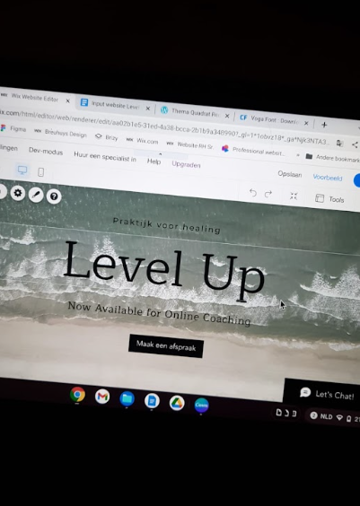
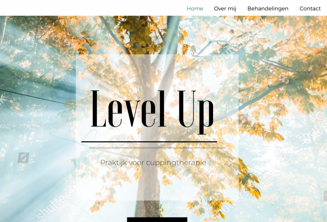
Webdesign
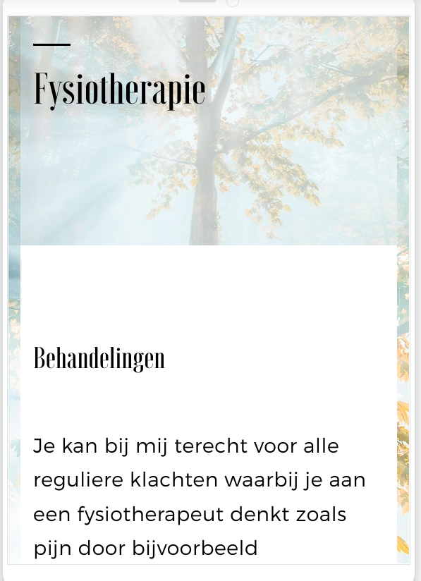
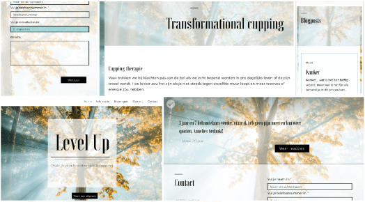
The next step was creating the website. For this we’ve used web design platform WiX.
This meant the continuation of the whole tuning process , with (more) logo options, texts edits, additional Insta posts and other first drafts sent back and forth.
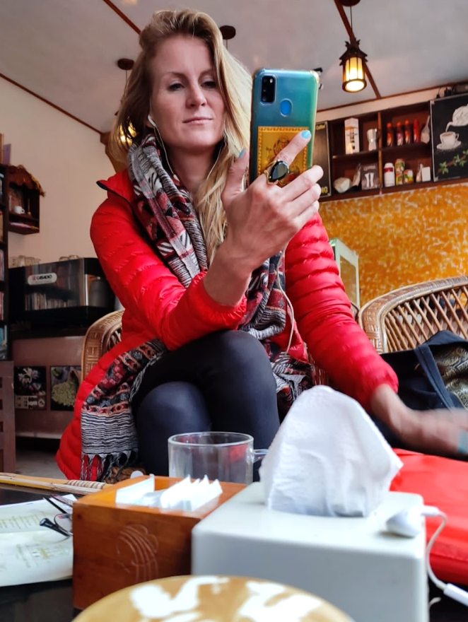
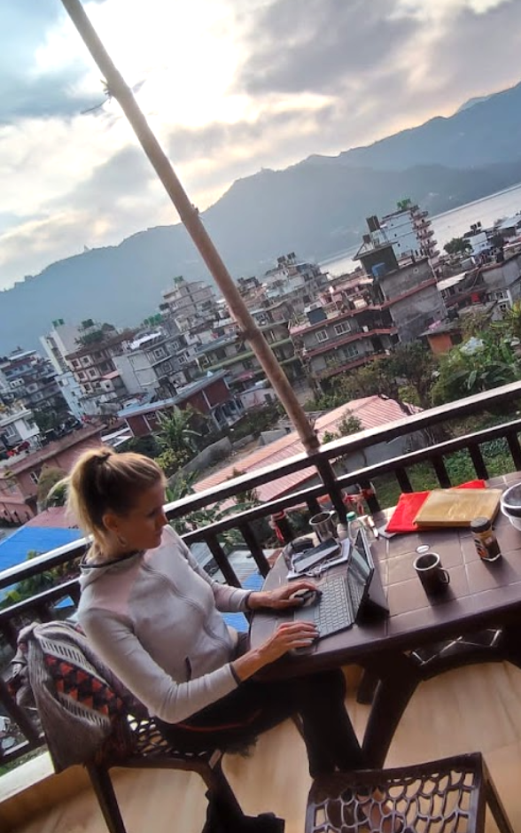
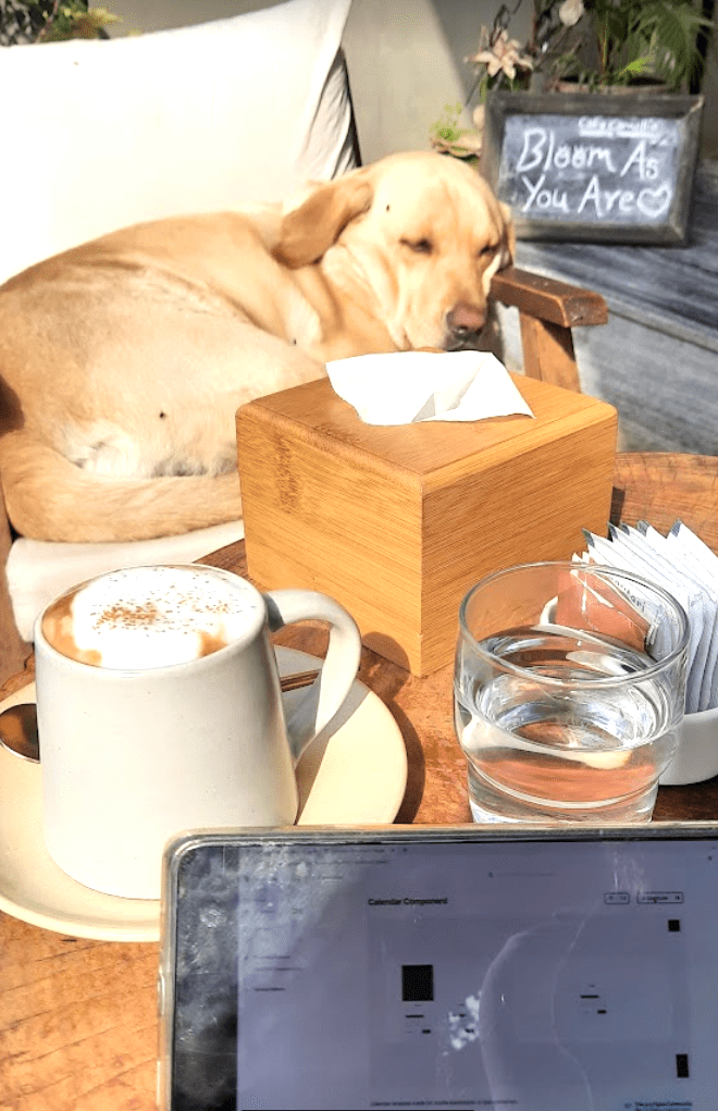
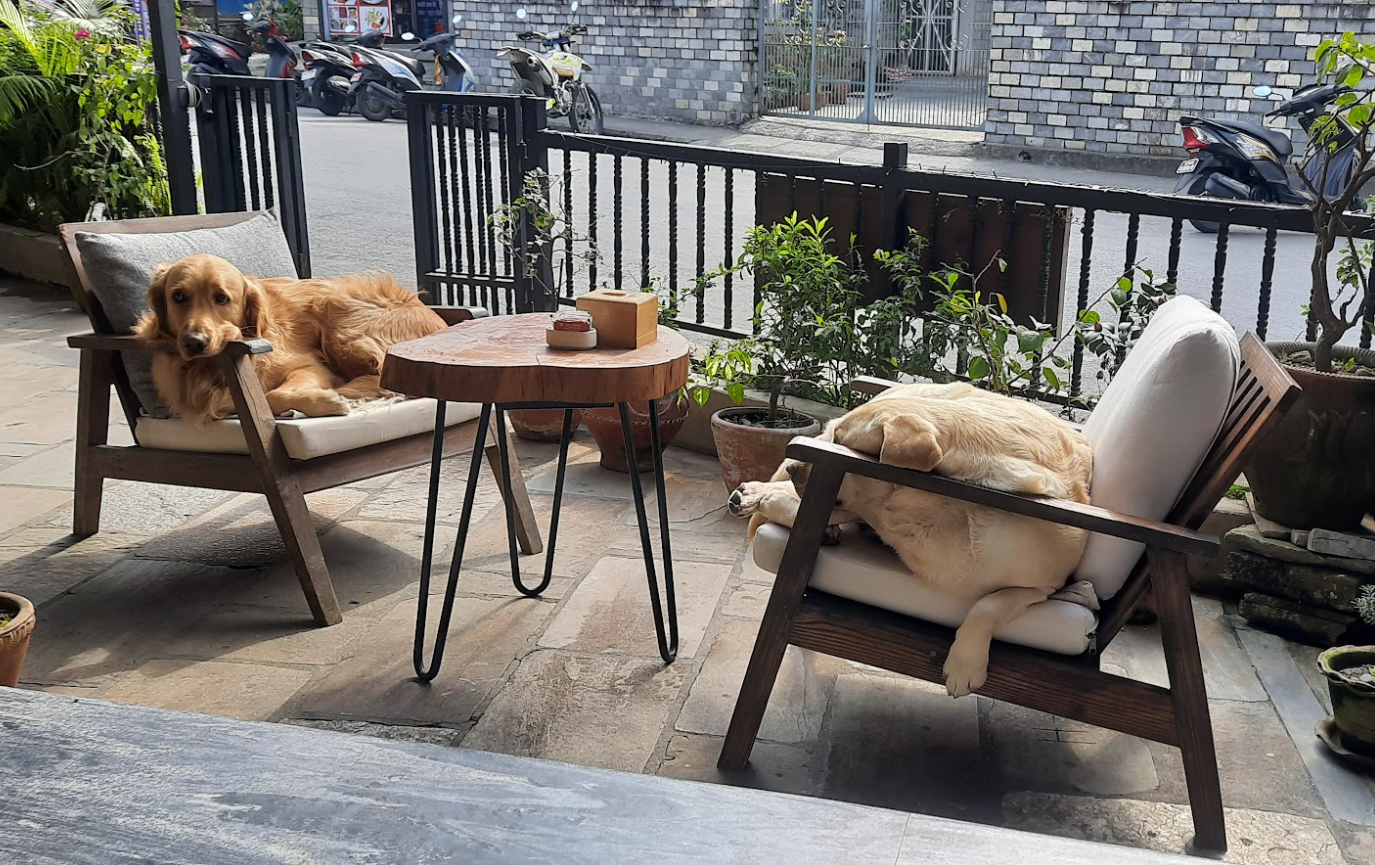
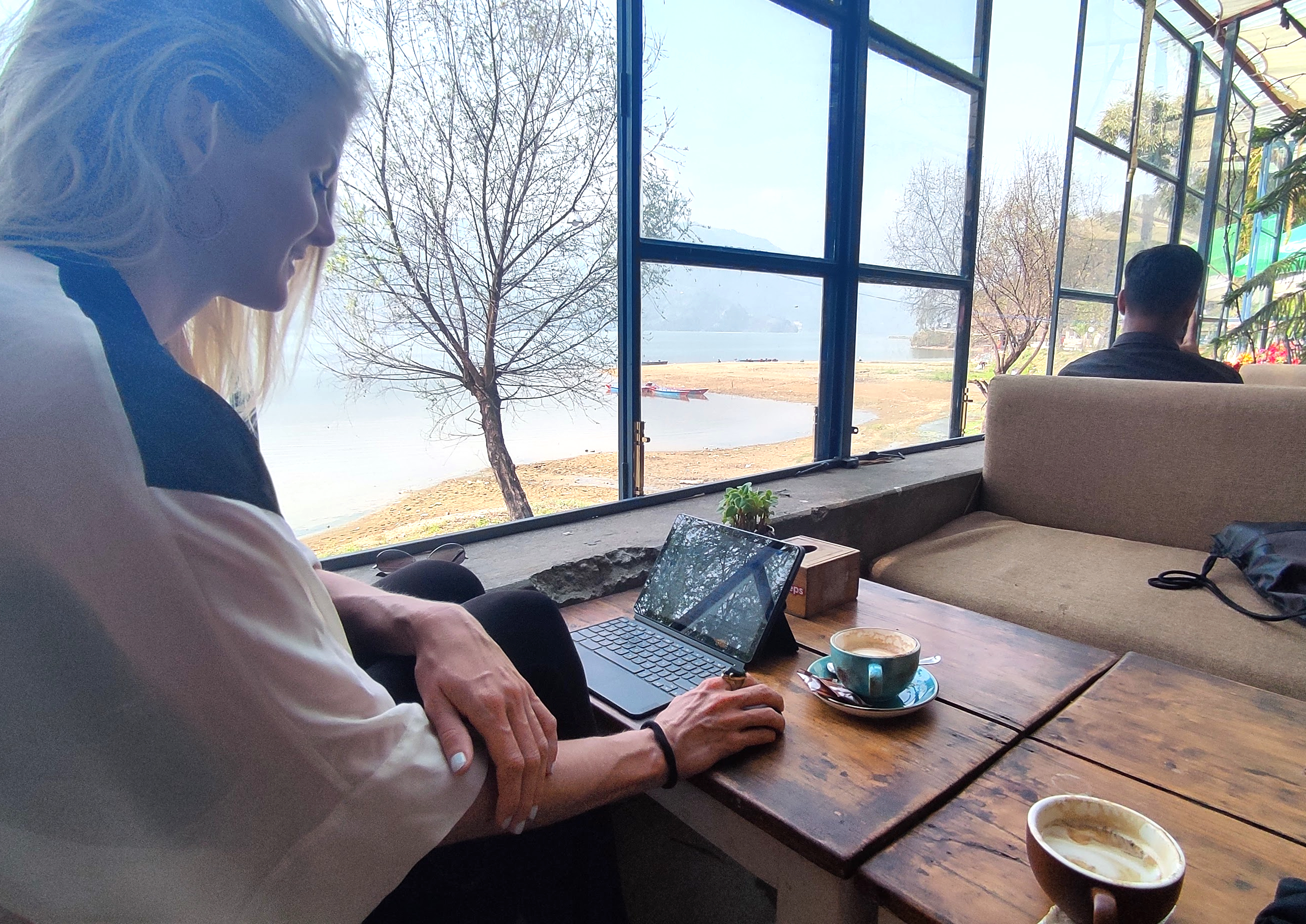
Working on the website remotely, at different workplaces – and with different co-workers – in Nepal
We wanted to give the website the same light feel of the logo, as well as the slogan and brand mission.
We’ve accomplished this by applying a couple of UX principles in the design:
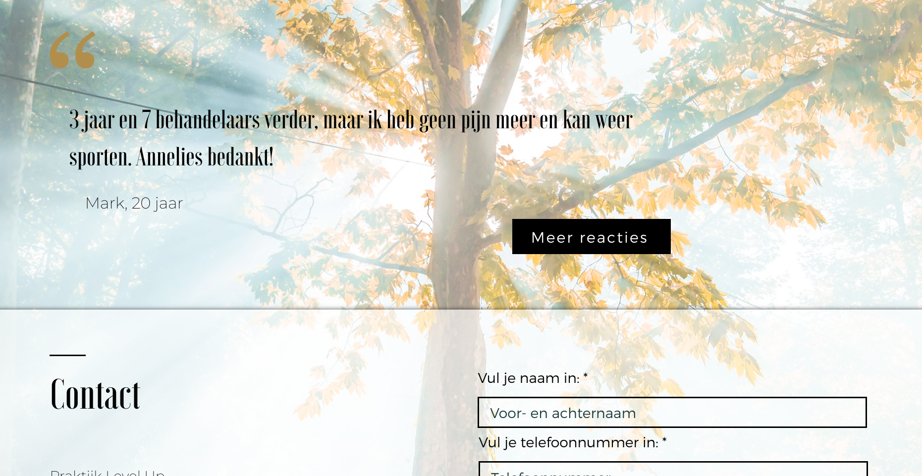
- adding a lot c.q. enough white or negative space (the areas of a page without print or pictures), for example around the logo and texts;
- making use of color transparancy (f.e. in the logo, but also with a number of strokes and in the margins).
- sticking to consistency & uniformity:
- using more or less the same lay-out, color combination and amount of text c.q. balance of text and images on the different pages;
- applying this on both the desktop as well as the mobile version.
- using the same logo type fonts for the titles and body text on the webpages and social media posts.
- applying buttons and forms in the same style.
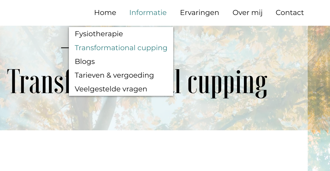
- using only 1 navigation bar at the top:
- not adding to many sublevels to the menu (but space to easily expand the number of pages or the texts and images at the same time).
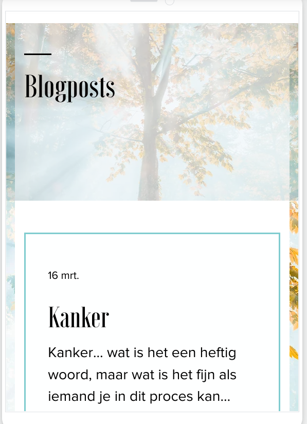
Additional design
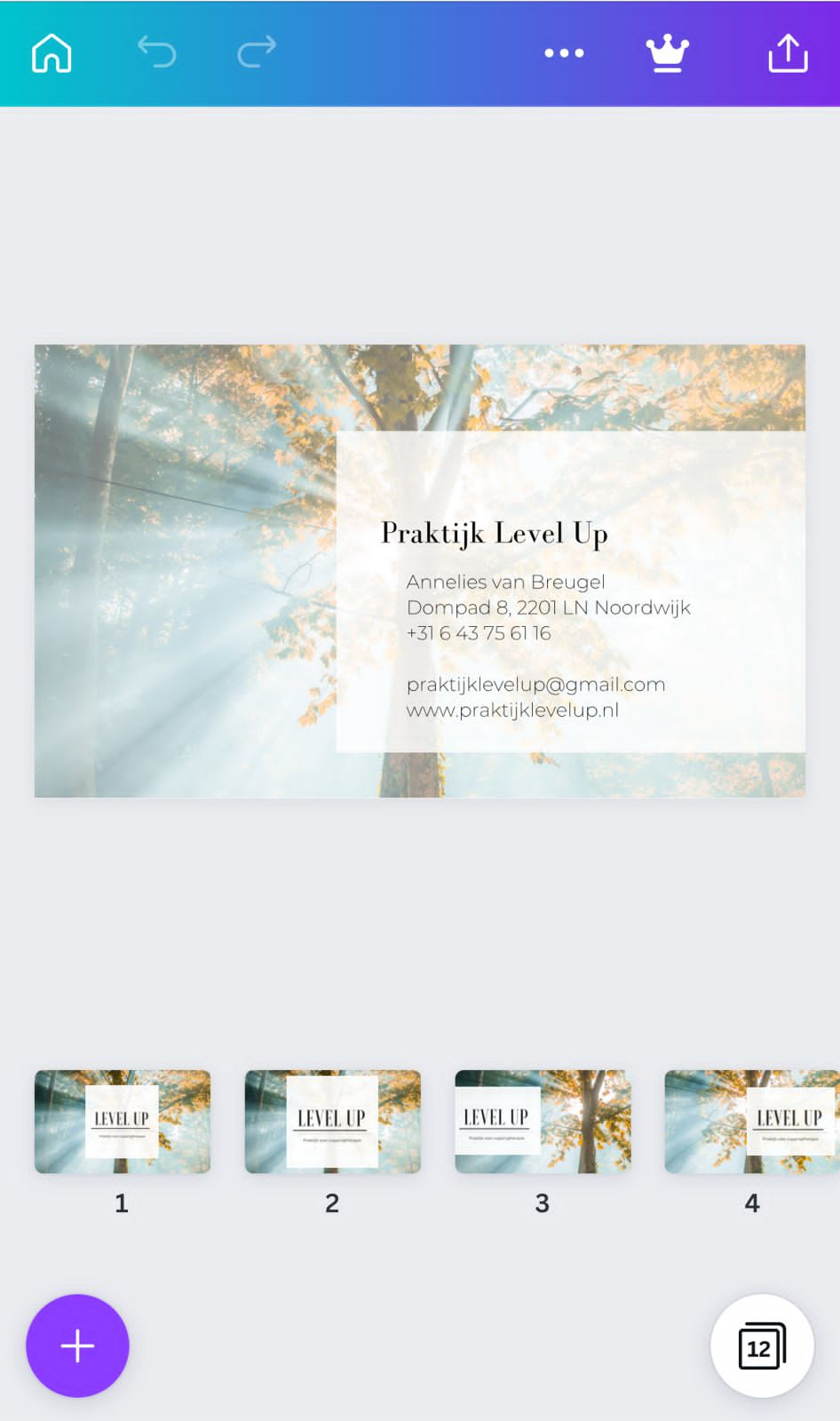
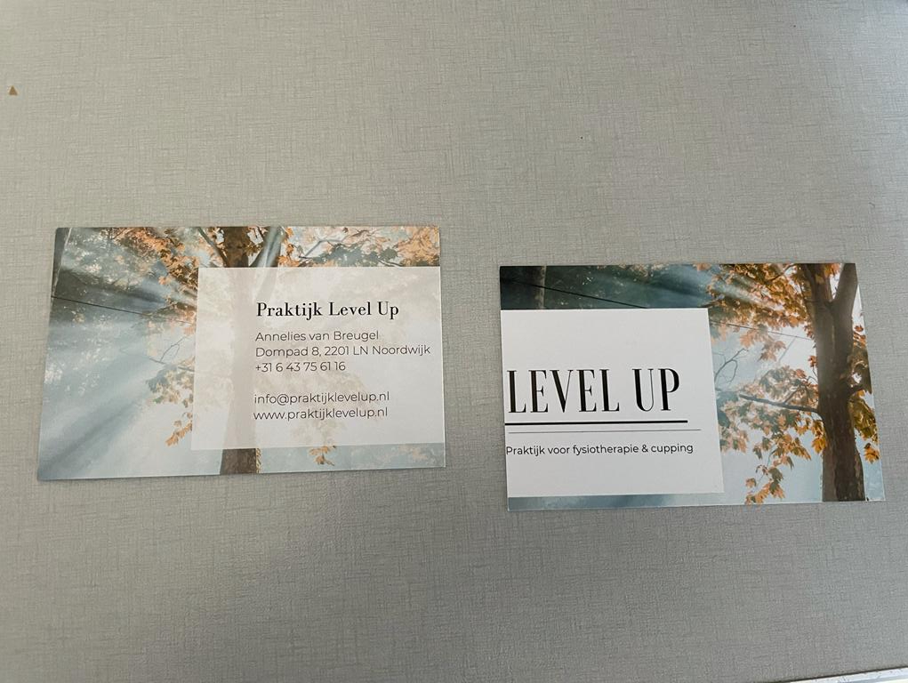
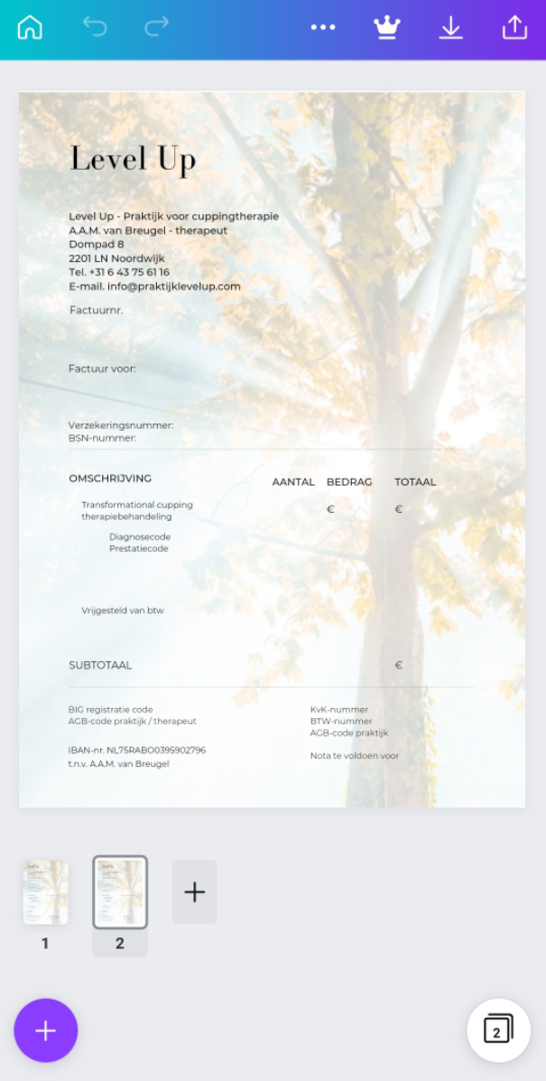
In addition to the logo, Insta posts and website, we also created a business card and invoice in the same Level Up style.
Here you can see the first drafts and the design in real life:
To be continued
So how did it go with the new business? Already before finishing this whole project together, Annelies welcomed her first customers! All very excited about her treatments, and about the branding.
Curious to see the design for yourself? Or learn more about the physiotherapy practice combined with transformational cuppping? Check out the website of Level Up, or get in touch!
Specifications
Project Type: corporate identity building
Company name: Level Up – praktijk voor fysiotherapie & cupping (physiotherapy practice & transformational cupping)
Business sector: healthcare
Completion Date: April 4, 2022
Country of Origin: Netherlands
Language: Dutch
Design tools / Building Format: Shutterstock, Coolors, Canva, WiX
Editor / Logo Designer / UX Designer: Breuhuys
Link: www.praktijklevelup.nl
